My Hope Lodge
The American Cancer Society (ACS) Hope Lodge is a home away from home for people facing cancer and their caregivers when cancer treatment is far away. There are 30+ Hope Lodge communities across the country that provide a free place to stay during treatment so people with cancer can focus on getting better.
This initial pilot launched at 3 locations (NYC, Lexington KY, and Baltimore MD) with a larger rollout to all locations in late 2024.
Responsibilities: Design Leadership, UX Direction, Visual Design, Art Direction
Agency: HLK

The ask
Create a digital tool that can quickly and easily help Hope Lodge guests and their caregivers during their stay. This tool should offer valuable information and resources to guests in one convenient location, allowing them to make the most of their cancer treatment and enhance their experience.

The process
ACS wanted to integrate a wide range of content sources, both digital and physical, into this app. This included local information unique to each lodge, day-to-day activities, and cancer-related resources.
The team got together to kick this project off, whiteboarding solutions and gathering questions.


Visiting the lodge
To better understand what we would be building and who we would be building for, our team conducted site visits at 3 unique locations - New York City, Honolulu, and St. Louis.
I visited the Hope Lodge in NYC where I had a walkthrough of the facility the Manager, answered my many questions, and provided insight into recent guest and staff feedback.
During these visits, we learned
The most asked question is “Where can I eat nearby?”
The second most asked question is “What’s the WiFi?”
Currently, most of the in-lodge communications are created manually and paper-based, the staff is eager to change their process to be more efficient and be able to focus on the guests.

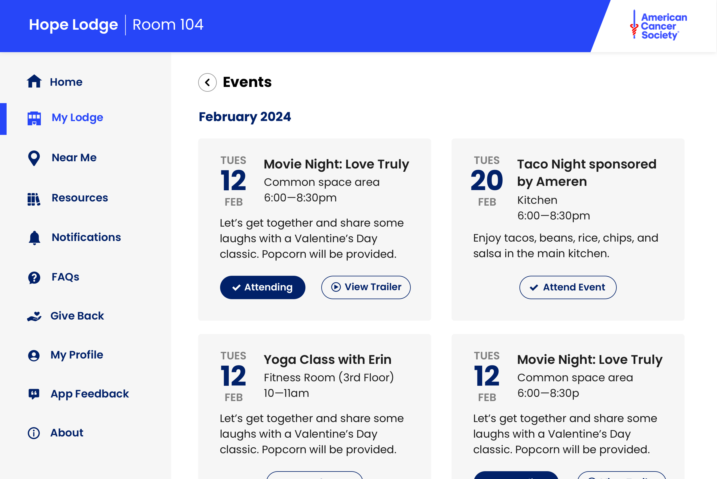
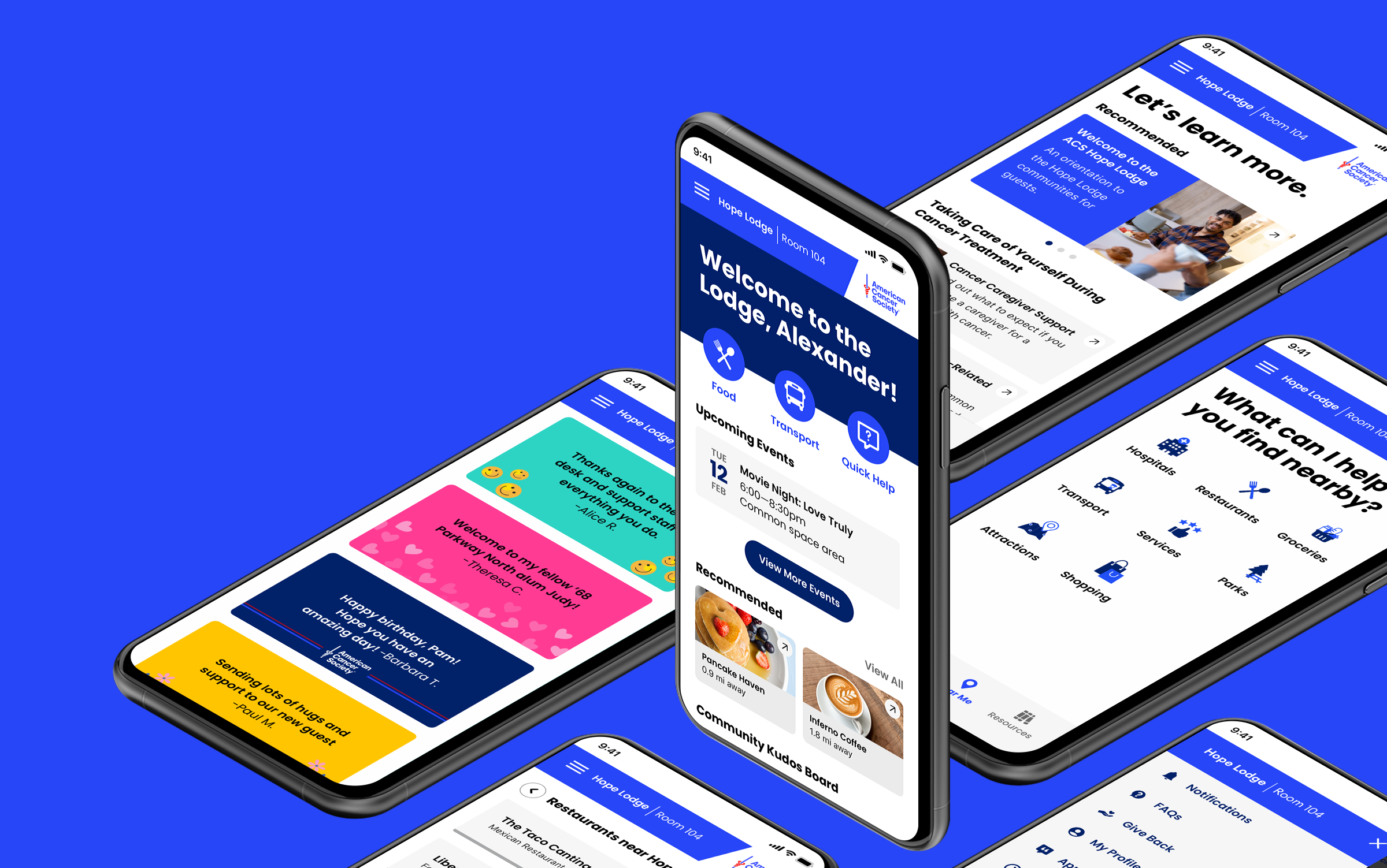
Defining the overall structure
To create an effective layout and architecture, we started by defining the user flow and key actions and information users needed at each step.
We used this as a basis to loosely build out the screen layouts while keeping in mind hierarchy, navigation, and accessibility.

Wireframing
Building on the overall structure, we introduced ways to use the existing design system, explore high-level copy, wrote CTAs, initial content content, and continued to define the flow of the app.
On the home screen, we included a warm dynamic message that would change based on the time of day. We also have quick links at the top of the screen to help get users answers to there most pressing questions (Food and Internet).
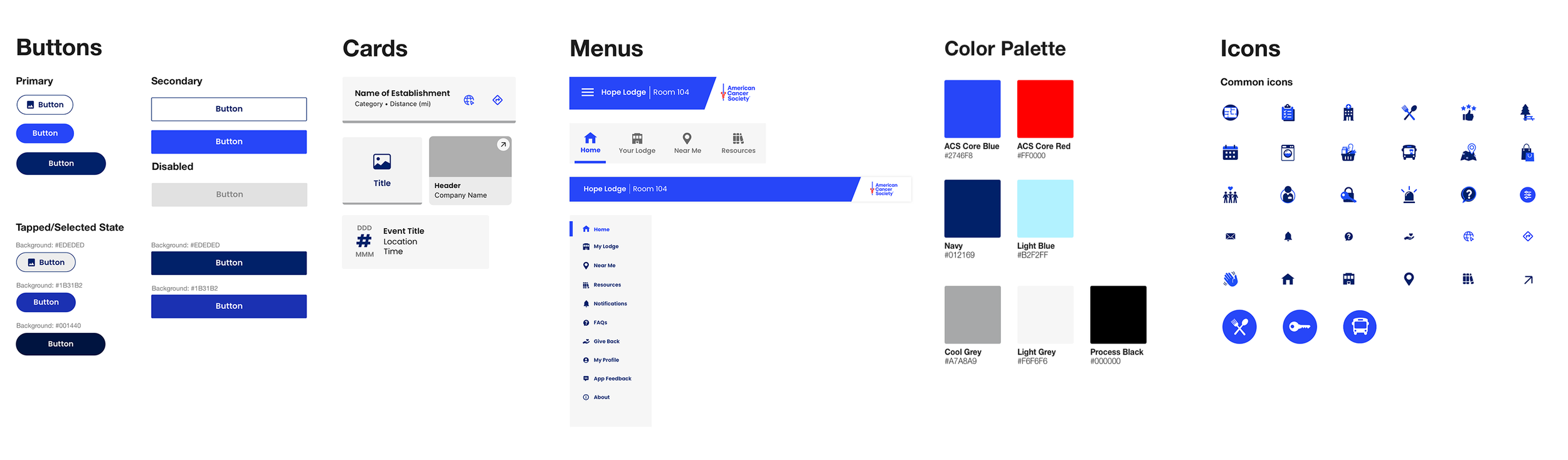
Visual Design
Building on the ACS Design system, we introduced new design patterns, styles, and icons.
Making sure every design element met ADA guideline established standards was extremely important.

Translating to tablet
After the initial mobile app launched, we needed to create a more tablet-friendly version of the app.